Made in America
Get Connected With



Choosing Flags For Business Advertising begins with a practical question: where will people see them? A flag beside a busy sidewalk needs bold colors and a short message. One displayed inside a showroom can carry more detail. Measure the available space, check viewing distance, and consider wind, rain, and sunlight before choosing materials. Small decisions matter.
Marketing expert Seth Godin wrote, “Marketing is no longer about the stuff that you make, but about the stories you tell.” A business flag can support that story, but it cannot tell the whole one. A clear logo, readable lettering, and colors that match your brand help passersby recognize your business quickly. Compare base options too: a cross base may suit indoor floors, while a ground stake may work better on soft outdoor surfaces. Confirm dimensions and care instructions with the supplier, since product specifications vary.
Keep the message simple. Really simple. Too much text can turn a moving flag into a blur, especially from across a parking lot. Yet a plain logo alone may not explain why someone should stop. That balance takes judgment, and there is no perfect formula. Test a design from the distance customers will view it, then revise what feels hard to read. The sections ahead explore flag styles, materials, placement, and design choices to help you make a more informed selection.
A business flag should begin with a clear advertising goal. Are you announcing a weekend sale, guiding visitors to an entrance, or making a new location easier to spot? Each purpose calls for different wording and placement. A directional flag needs a short action and a visible arrow. A promotional flag may need one offer, not a list of services. Keep it simple.
Then consider who needs to notice it. Commuters in moving traffic have only seconds to read a message, while pedestrians near a storefront may have time for a few extra details. Think about their viewing distance, direction of travel, and likely concerns. A family approaching a community event may respond to welcoming language; a contractor near a trade fair may look for a specific service. Match the message to the audience’s actual needs, not assumptions about them.
The setting matters, too. A flag partly hidden by parked cars or competing signs cannot do its job, however polished the design looks. Check visibility at different times of day, and read the message from the distance your audience will see it. Test it outdoors. Colors can look different in strong sun, and wind may fold fabric across important words. Even careful planning can miss something; revise after observing how people move past the display.
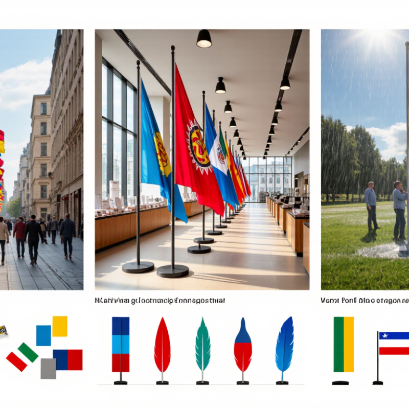
A flag should fit the place where people will actually see it. Outside a storefront, a feather flag can rise above parked cars and draw attention from passing traffic. Its narrow shape moves in the breeze, but may be hard to read from the side. A rectangular flag offers more room for a short message. It often works better near a walkway, where visitors have time to look. Keep the wording brief; small text quickly disappears at a distance.
Indoor displays need a different approach. A lightweight banner pole can stand near a reception desk without blocking conversation. Table flags suit counters and event tables, but they should not compete with menus, product samples, or staff. Check ceiling height, door swings, and sight lines before choosing a size. Measure twice. A flag that looks balanced in an empty room may feel oversized once furniture and people are present.
Wind and mounting surfaces matter outdoors. A ground spike may be practical in soft soil, while a weighted base is better for a paved entrance. Neither suits every site. Check the expected weather and the display area’s exposure, and avoid placing a flag where it narrows a busy path. Even careful planning can miss changing foot traffic, so review the placement after a day of use. Visibility is useful; obstruction is not.
Choose flag size by viewing distance and placement, not by the urge to buy the largest option. A small entrance flag can guide pedestrians without blocking a doorway; a roadside flag needs larger lettering and strong contrast to register quickly. Keep the message short. Measure twice. OAAA reported U.S. out-of-home advertising revenue of $9.1 billion in 2023, a sign that physical placements remain a significant advertising channel. But a flag still needs to suit its actual setting.
Material affects movement, print quality, and upkeep. Textile Exchange’s 2023 Materials Market Report estimated that polyester represented 54% of global fiber production in 2022. Its popularity does not make every polyester fabric right for every site. Knitted polyester can allow more airflow, while denser fabrics may create a fuller look in light wind. Ask for fabric weight, edge-finish details, and colorfastness information. A fabric swatch outdoors may reveal more than a product photo.
Dye sublimation bonds color into the fibers and can reproduce detailed artwork well. Screen printing may suit simpler designs and repeat orders, though setup can make small runs less practical. Single-sided flags often show a reversed image through the fabric; double-sided construction improves readability but adds weight. That trade-off is easy to overlook. Check how the flag reads from both directions before approving the print file.
How to Choose Flags for Business Advertising
Assess Design Clarity, Visibility, and Brand Fit
A business flag has only a moment to catch someone’s eye. Keep its main message short, and use lettering that remains readable from across a sidewalk or parking lot. Strong contrast helps, but too many colors can make the design feel noisy. Step back and view a printed sample from several distances. It may look sharp on a screen and still blur outdoors.
Visibility depends on more than size. Check the flag’s height, placement, and likely viewing angle before choosing a shape. A tall feather flag can stand out near an entrance, while a horizontal flag may suit a wide storefront. Consider how wind affects the fabric; a message that folds over itself loses clarity. Match colors and imagery to your business’s usual look, but avoid forcing every detail into the design. I’ve seen simple layouts work better, though that is not a guarantee.
Tips: Test a draft in daylight. Ask someone unfamiliar with the design to read it from ten paces away. If they hesitate, remove a word or enlarge the text. Keep essential details away from edges, where seams or movement can hide them.
| Flag Option | Design Clarity | Visibility Considerations | Brand Fit | Best-Suited Use | Practical Check |
|---|---|---|---|---|---|
| Feather flag | Use a short headline, one clear visual, and limited supporting text. Keep key content away from curved edges. | Tall profile can help it stand out in outdoor approaches; movement and viewing angle may affect how much of the message is readable. | Works well for energetic, approachable, or event-focused messaging. | Storefront approaches, event entrances, and outdoor promotions. | View the design at a distance and check that the main message remains legible when the fabric curves or moves. |
| Teardrop flag | The taut shape can support a compact logo-free message or simple graphic; allow for the curved outline when positioning text. | Its defined shape can remain recognizable in light wind, but the available print area is narrower than on many rectangular formats. | Fits clean, modern, or directional messaging with a simple visual hierarchy. | Trade shows, entrance points, and temporary outdoor displays. | Keep essential wording within the main printable area and confirm the artwork follows the flag template. |
| Rectangular pole flag | Offers a straightforward layout for a headline and supporting information; avoid crowding the field with small text. | Can provide a broad face toward a chosen viewing direction; visibility depends on mounting height, surroundings, and wind. | Suitable for formal, institutional, or established visual styles. | Building frontage, campus settings, and planned outdoor installations. | Check the viewing direction, pole location, and clearance from trees, signs, and nearby structures. |
| Horizontal banner flag | Wide proportions suit a concise headline or a short offer; keep the message readable from left to right. | Useful where viewers approach from the front, though folds or slack fabric can obscure parts of the design. | Good for practical, promotional, or information-led messaging. | Fences, temporary barriers, and event perimeters. | Confirm the fixing points keep the banner reasonably flat and that text is not hidden by seams or fasteners. |
| Tabletop flag | Use one short message or a simple symbol; small print is difficult to read across a room. | Visibility is limited to nearby visitors and may be blocked by other items on the table. | Works for understated, service-oriented, or information-focused settings. | Reception desks, registration tables, and indoor counters. | Place it above surrounding materials and test readability from the typical visitor position. |
| Large-format event flag | Prioritize one main message and strong contrast; reduce secondary copy to preserve readability at a distance. | Greater display area may improve prominence, but placement, competing visuals, and sightlines remain important. | Suited to high-energy campaigns and large public events when the design stays consistent with other materials. | Outdoor festivals, sports events, and large venue approaches. | Review the design in context, including expected viewing distance, background, wind exposure, and installation rules. |
Selection guide: Favor a simple, high-contrast layout with a clear focal point. Check the flag template, material, mounting method, site conditions, and local display requirements before ordering.
A business flag works best when its location is planned before the fabric is ordered. Check the wind exposure, nearby doors, and sightlines from the street. A flag that blocks a walkway or twists around a pole quickly becomes a nuisance. Measure the pole height and mounting space, then choose a size that remains readable without crowding the entrance. Small details matter.
Use hardware suited to the surface, and follow the pole maker’s installation guidance. On soft ground, push the base firmly into stable soil; on pavement, use a weighted base designed for outdoor use. Check fasteners after the first windy day. They loosen. If the flag snaps sharply or strains its stitching, take it down until conditions improve. Local weather can change faster than a display plan.
Regular care extends useful life. Shake off dust, wash according to the fabric care label, and let the flag dry fully before storing it. Damp folds can leave mildew or odors. Inspect seams, clips, and hems every few weeks; minor fraying is easier to catch early, though repairs may not look perfect. When colors fade or a promotion ends, reuse sound fabric for indoor displays, event backdrops, or protective covers for storage. Keep reusable pieces labeled by size and condition, so staff can find them without guesswork.